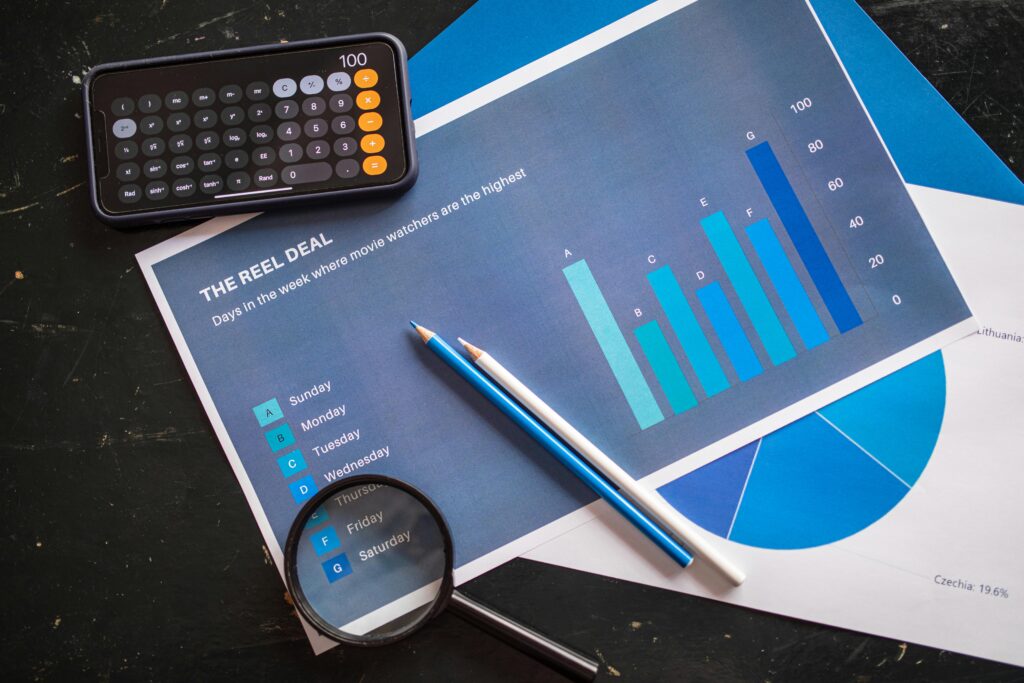
Description and visualisation involve summarising and presenting data in a clear, understandable way. This service helps you see the important trends and patterns in your data by turning complex information into easy-to-read charts, graphs, and reports. By making data visually appealing and easier to interpret, it ensures that key insights are communicated effectively to stakeholders.
- Data Summarisation
- Descriptive Statistics: Basic statistical measures such as mean, median, mode, and range provide a quick overview of your data’s central tendencies and dispersion.
- Frequency Distribution: Using histograms and bar charts, you can see how often values occur within your data set, making it easier to spot patterns and outliers.
- Summary Tables: Tools like aggregate data tables and pivot tables help in summarising large data sets, providing a clear snapshot of key metrics and statistics.
- Data Visualisation
- Charts and Graphs: Various types of charts and graphs (line charts, bar charts, pie charts, scatter plots, bubble charts, and area charts) are used to represent data visually, making complex data sets more accessible and understandable.
- Interactive Dashboards: These dashboards allow for real-time data visualisation and customisation, providing dynamic insights. Features like drill-down capabilities enable users to explore data in greater detail and understand the underlying factors behind the numbers.
- Advanced Visualisation Techniques
- Heatmaps: Useful for showing the density or intensity of data points, making it easy to identify hotspots or areas of interest.
- Geospatial Maps: Mapping data geographically to see spatial patterns and relationships, ideal for location-based analysis.
- Tree Maps: Displaying hierarchical data in a nested format to show part-to-whole relationships.
- Network Graphs: Visualising relationships and connections within data, useful for social network analysis or organisational mapping.
- Reporting
- Automated Reports: Generate reports automatically at scheduled intervals, ensuring that stakeholders always have the latest data.
- Custom Reports: Tailored reports to meet specific needs, providing in-depth analysis on areas of interest.
- Executive Summaries: High-level overviews designed for senior management, highlighting key findings and actionable insights.
- Infographics
- Data Storytelling: Crafting narratives that combine data and visual elements to tell a compelling story.
- Visual Narratives: Using visuals to guide the audience through the data, making complex information digestible.
- Infographic Design: Creating engaging and informative infographics that highlight key data points and trends.

